
I just happened to have received the perfect colour of cardstock in my Studio Calico January kit so that formed my background. I also had a hand-made embellishment sent to me from Pearl in Singapore, that I still had sitting on the paint tray in front of my desk, waiting to complete the perfect layout.

I also happened to have the perfect paint in the darker mauve shade & my last lovely LYB doily that I knew would be the perfect way to incorporate the white. The grid paper is Glitz Design that I misted with various complimentary colours from the palette choice, aswell as the back of a Glitz Design card.

I was impatient waiting for the misted paper to dry - which had got quite soggy with all the different colours I had layered on top of each other, so the trimmer was getting snagged up so I just decided to go with it & tear the paper instead. I recoloured Pearl's handmade embellishment but used it as a STAMPING TOOL before I adhered it to my layout, thus creating the weird shaped little "thingies" emanating from the doily (which I dabbed with a paper towel to create that blotchy effect).

I'm crazy about fonts & typography so was in my element creating this nice long title over here! Using a selection of thickers (that I don't think one can EVER have enough of!)

I hand-wrote the journaling "and days filled with passion & purpose" on a strip of photo-paper destined for the bin (an offcut after I had printed out my photographs) so it's nice & shiny. I cut freehand around it for an interesting organic look.

You'll notice that I often convert photos of my husband to black & white. This is because he suffers from Rosacea so often has a flushed appearance, so his skintone doesn't blend in too well with everyone else! I happened to have printed this photo in B/W before deciding to use it here, but B/W is also a good idea to use when dealing with these very pale, chalky palettes, as there are no distracting colours in the photograph to clash with the papers & embellishments.

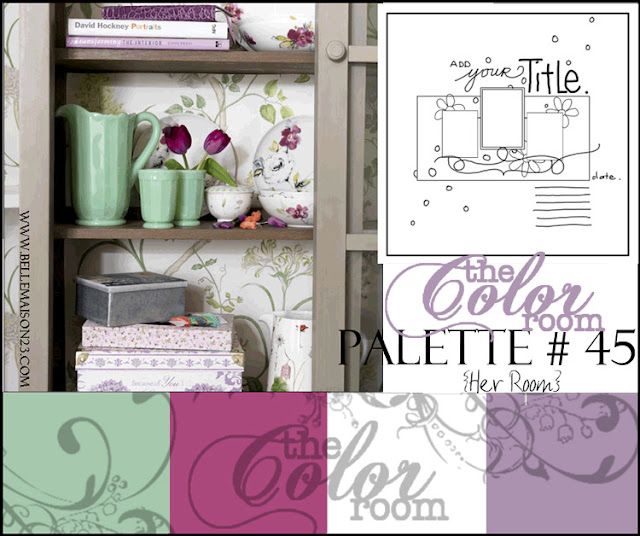
Whenever permissable I combine a colour challenge with a sketch challenge "to kill two birds with one stone" so I based my layout on this Pencil Lines sketch & also managed to tie it in with a word challenge over at "Bird is the Word" that required that I use the word "Passion" somewhere on my layout.
Supplies:-
American Crafts Cardstock & Thickers
Glitz Design grid paper, journaling card & frame stickers
Maya Mists/Tattered Angels Glimmer Mists
Making Memories paint & flocked journaling sticker
Handmade embellishment - Pearl Liu
Hambly Studios Doily transparency stickers
Little Yellow Bicycle mini-doily
11 comments:
wonderful job on this great sketch and Iluv the colors to!!
I hope you also visit to my blog visits.
and that there also love what I do!
and have a great weekend
~Carla
Beautiful!
this is really sooo beautiful!!
Helen, I think the background color really give a cool effect to the whole page. I love this so much!! What a beautiful family you have! And ehem.. great take on the sketch!! :)))
absolutely spot on the palette , grrl ! you make it look so easy !
You really should be the color queen, I never seen any one as good as you when come to color challenges, I love the different alphabet, what a clever way to used them, but most of all, I love that fuzzy cut text line, really cool!
Oh what a beautiful beautiful layout of a lovely family! I do really love the colours here and all the techniques. I am impatient too with drying times..lol. Thanks sooooooooo much for joining in at Bird Is The Word..how cool to "kill 2 birds with one stone". I should do more of that too!
I just love the green with the mauve, never would try that....but it is so beautiful. I need to experiement more. I love the photos and yes I love different fonts too, you did awesome my dear friend. Good luck in the comps. Melxx
Thanks so much girls - I think the trick with the colour challenges is really just to stick to the palette & you can't go wrong - with mists & paint it's so easy to get the shades right. Hope you are all having a blessed Sunday xx
Beautiful. One of my fav's of yours xx
Stunning palette and what a wonderful interpretation of this sketch.
Post a Comment